That conclusion breaks down if you break that assumption! There are regions on the correlation matrices I plotted last time where the gain in time is very similar for different events. Which regions are physically realistic? Can I really improve my swimming speed from 1 km/hr to 30 km/hr? Is it worth it to sacrifice 3 km/hr on the bike in order to gain 2 km/hr on the run? The answer might really depend on which speed you're starting from and which speed you're going to for each event.
To get a more grounded idea of the relevant speeds, I downloaded the data from all 429 competitors in the Overall category for our race so we can see how actual athletes perform (data available here - my team was in the relay category so it doesn't include us).
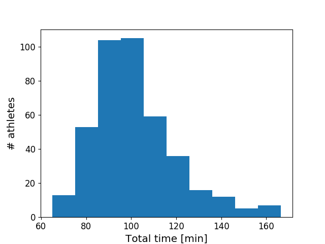
When you look at how the overall triathlon finishing times are distributed, the first thing that pops out is that the top finishers are closer to the pack than the long tail of slower athletes:

\[
\Delta T = \frac{d}{v} \left(1 - \frac{1}{f}\right)
\]
- so it's not a linear relationship.
When you look at how the times for each event are distributed, there's a significant overlap between events in how long it takes - the fastest runners finish their 5k faster than a significant chunk of the swimmers (myself included)!

Considering the amount of overlap above, I was surprised by how neatly the events separate themselves out in terms of speed. Each event occupies a pretty well-defined space all by itself:

Next up (probably): focusing in on the space these speeds occupy on the correlation matrices from last time.
Edit: I updated the speed histograms with a fit to a Gaussian. The agreement looks pretty good!

No comments:
Post a Comment